
Contextual notifications on your bank app
Sept 2019 - June 2020
Since RBC Mobile was the leading channel for clients to do their everyday banking and as its capabilities continued to grow, there was a need to present relevant content to clients while leveraging the same amount of real-estate
My Role
I was tasked with designing a new component and establishing a design system for contextual notifications. I influenced the notification content strategy by working closely with my product partners.
Impact
The component design system contributed to a 75% expansion rate and 25% click-through rate for our credit card onboarding experience.

Aligning with RBC app’s different business objectives
The Challenge
Timely & relevant
The challenge was to create a visual component to present timely and relevant information with clear calls of actions to clients, based on different business objectives.
Since 80% of client’s sessions take place on their account page(s) and over 50% of the session time is spent there, we believed this was the best starting point to launch contextual notices.
High-level goals:
Create visual hierarchy to help clients choose the right course of action.
Design a component that could be used to present different content based on business needs that will ultimately add value and increase clients’ engagement.
Build a flexible architecture to allow future integration of content management systems for presentment.

Finalized Icon design for the notification types & urgency levels 👆🏼
Sorting into categories
Before designing the component, my team and I organized existing and future content that will be shown to clients into categories. Through a series of workshops, we audited all existing content that we presented to personal & business banking clients across different accounts and potential messages we could send in the future to improve clients’ financial health. We organized the results into spreadsheets, sorted all content by types of notifications & urgency levels.
Exploring logic
Once we had our categories, the team and I explored how the urgency levels and types of notifications could work together in different scenarios. For example, I explored the idea of having grouped smart notifications based on different scenarios clients could find themselves in.
Exploring grouped notifications for everyday banking accounts:
Account in Overdraft (Immediate)
Client’s account goes into overdraft and incurs fees.
Sign Up for Overdraft Protection (Tasks)
Suggest clients to sign up for overdraft protection to avoid fees in the future.
Cash Flow Analysis (Insights)
Insight for clients to understand how they went into overdraft.
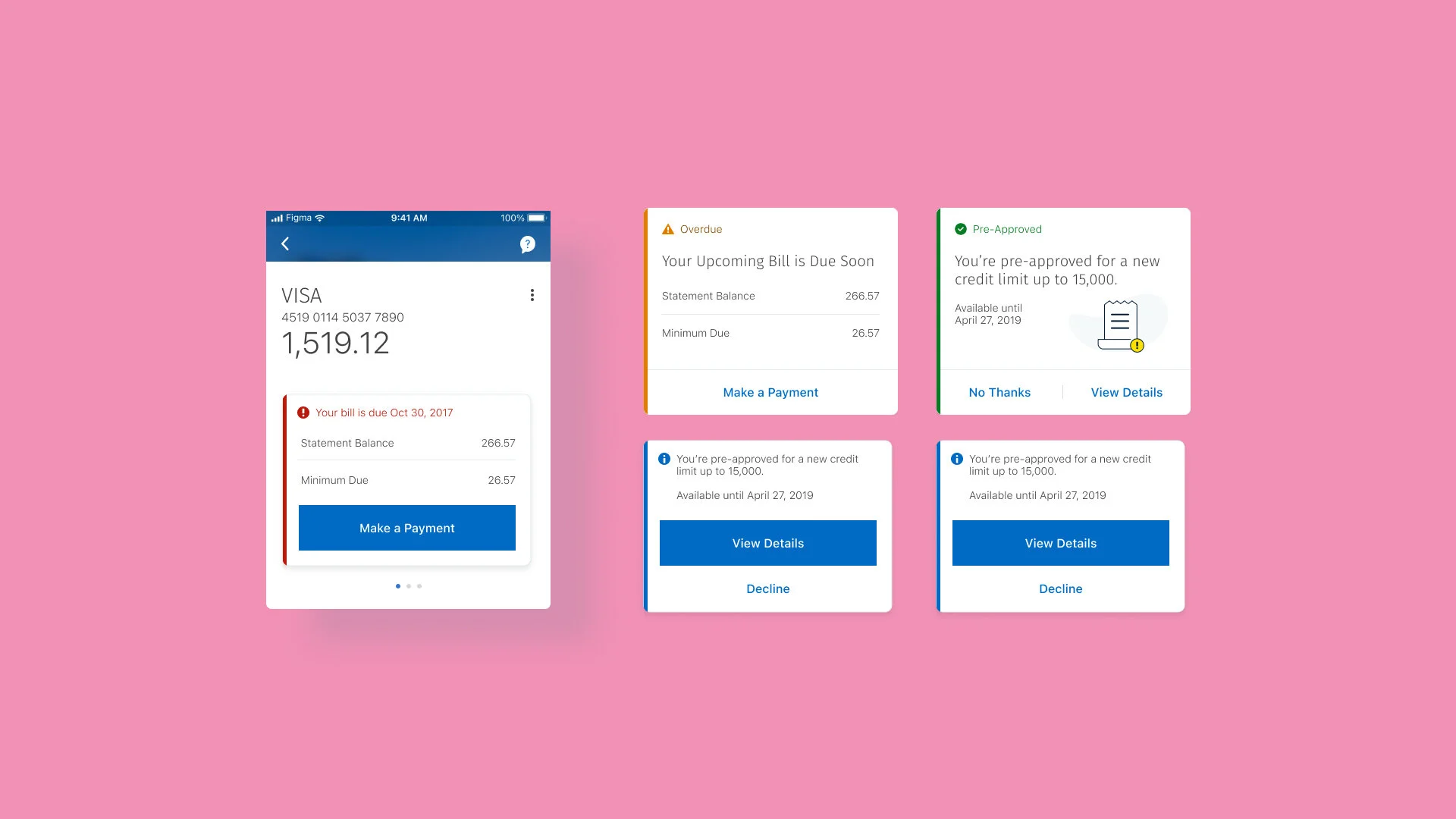
Urgency Levels & Notification Types
-

Immediate
Critical information that requires your immediate action.
-

Upcoming
Time remaining is limited for you to take action.
-

Offers
Communicates any financial offers available to you.
-

Tasks & Onboarding
Tasks you can complete to enhance your banking experience.
-

Insights
Relevant information about any of your accounts, but not critical.
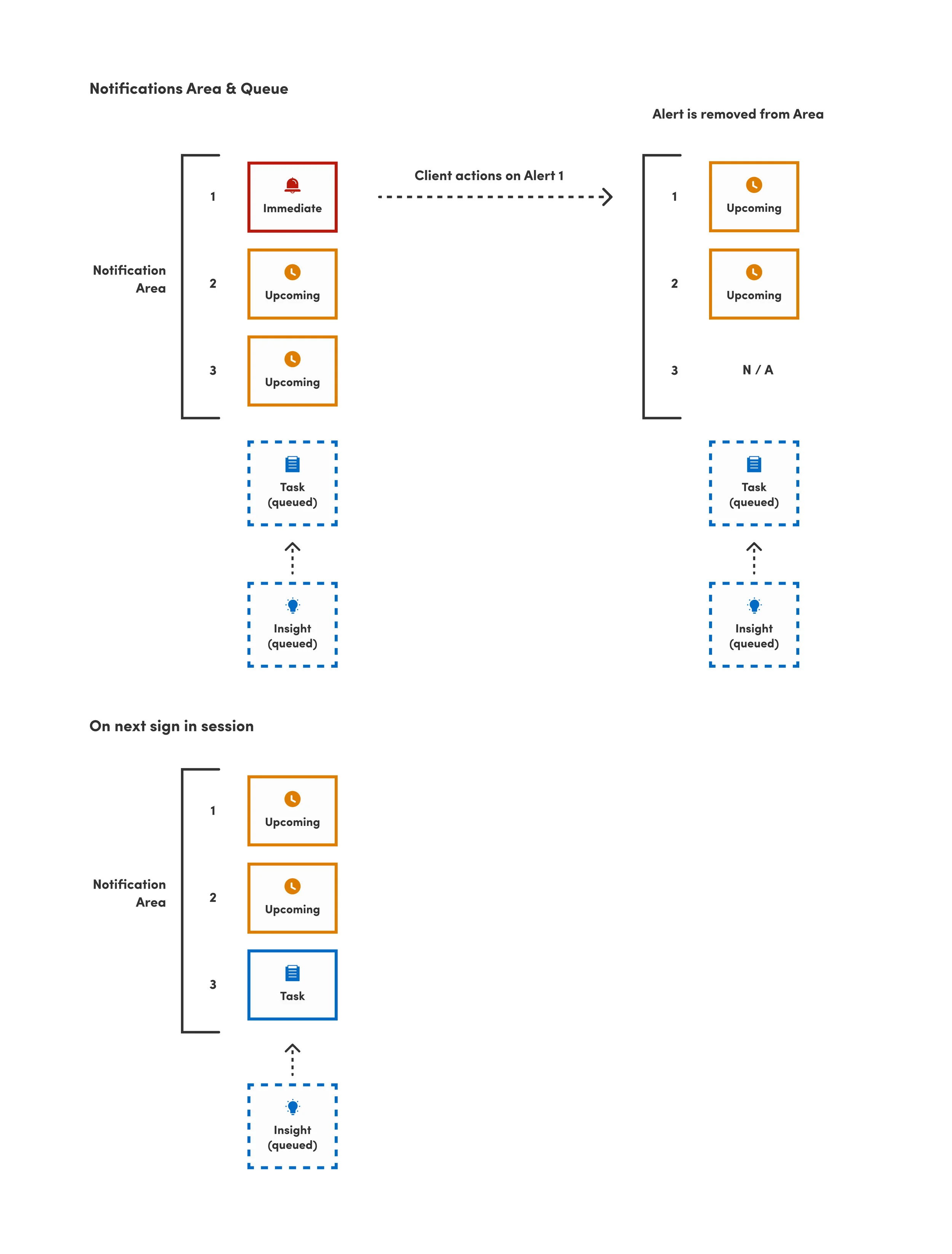
Phase 1
Keeping it simple
For our first release, we kept the rules and the order of urgency levels simple due to technical restraints. This logic will hopefully grow to be dynamic in future releases.
Urgency 1 = Immediate (Red)
Urgency 2 = Upcoming (Orange)
Urgency 3 = Insights, Tasks, and Offers (Blue & Green)
When a notification is actioned, the notification is removed. When the client signs in at a later session, the notification area will update to include the next notification from the queue based on urgency levels.
My Role
Conceptualization
During my exploration phase, I tried various component treatments within the account page - different placements, button styles, colours, icons, widths, and layout with & without illustration. Some of the questions that I kept in mind were:
Can the component fit different types of alerts and actions? (Dismiss/postpone, accept, decline)
Can this component work in other areas of the app? e.g. Dashboard, Account Summary, Account Pages or inline in a flow.
Collapsed state vs Expanded? Which is more effective? Is expanded state taking up too much real estate on the account page?


Component Design
-
Icon & Colour System
Sticking with conventional icons & colours associated with each type of notification and urgency level, I assumed clients would understand the context of the message right away.
-
Collapsed & Expanded
With the assumption that clients wouldn’t want these notifications taking up space on their account pages, we kept the collapsed & expanded states from the concepts. Since an immediate notification should be actioned right away, its expanded by default when the client lands on their account page.
-
Calls to Actions
There are three treatments for CTAs based on type of notification. Immediate notifications display one primary button, leaving the client no other choice but to take action. Upcoming, Tasks, Offers and Insights have the flexibility of choosing between one or two tertiary buttons.
-
Carousel
The carousel has a "peeking" design that allows clients to see the next or previous notification. I assumed that clients would see this as an indication that they can scroll right if they have additional notifications to view. Since notifications live in a carousel, when one notification is expanded, the rest of the them also expand.
-
Fixed Height
Since notifications live in a carousel on the account pages, I couldn’t go with dynamic height based on content. Instead, an ideal fixed height had to be set that could accommodate different lengths of content. The trade off in this, was excessive white space within the notification when the content was short. 😕
-
Character Counts & Guidelines:
Since we had to set a fixed height, I also had to provide character counts to our content management partners & writers. This was based on stress-testing on smaller devices.

Usability Testing
Assumptions proven correct
Luckily for me, my assumptions about the various aspects of the component design were proven correct in our usability studies.
Icon & Colour System
Participants associated red and orange notices as critical. They understood that the alarm bell icon signifies “need to look at right away” and the timer icon to signify “due soon”.
Participants associated blue and green notices as optional and there were a couple who stated the blue notices are “neutral” and aligned with the general branding of RBC. 💯
Collapsed & Expanded
More participants preferred seeing the collapsed state initially when landing on their account page. Most of them stated that it was “cleaner” and doesn’t take up as much space on the screen.
However, participants gave feedback that the expanded state could be more effective and easier to use because it shows full message and provides the button to perform the action.
Relevant & timely
Participants do not mind seeing notifications as along as they are relevant. Most of them recommended not showing more than 4-5 at a time.
In general, participants were okay seeing the immediate and upcoming notices all the time. They would want to see the tasks, insights and offers less.

Keeping logic simple
Impact & Results
The component has been very successful, with over 75% expand rate and over 25% average click-through rate for Activate Card and Credit Card Onboarding notifications (both under Tasks / Onboarding). Our work in the first phase of contextual notifications is transforming the way clients are informed about the health of their accounts and for RBC products & services. This component was proven scalable when it was leveraged for other places in the app such as the Needs Attention Tile on RBC Mobile’s Dashboard.
Overall, I really enjoyed the process and exploration it took to the final component design. It involved trail & error, stress-testing and letting myself explore any idea that came to mind.