
Opening a Bank Account on Your Phone
Feb 2020 - Nov 2020
Up until 2019, the RBC Mobile App had been the go to channel for existing clients to do their everyday banking. However, the app failed in providing an easy account open experience for prospect clients. When COVID-19 was declared a pandemic, it became even more essential to allow people to open an account through the app - without ever having to go into a branch. I was part of an ambitious project to redesign the mobile account open experience for RBC prospects.
My Role
As the lead visual designer, I worked alongside with design, product and development teams to redesign the mobile account open flow for prospects. I conceptualized the creative direction of the flow and led the consistency of the visual design throughout mobile & web.
Impact
We were able to reduce the average time it took to open an account while increasing conversion rates. We also created a strong design foundation that other products could leverage for their account open experiences.
The Problem
A disjointed experience
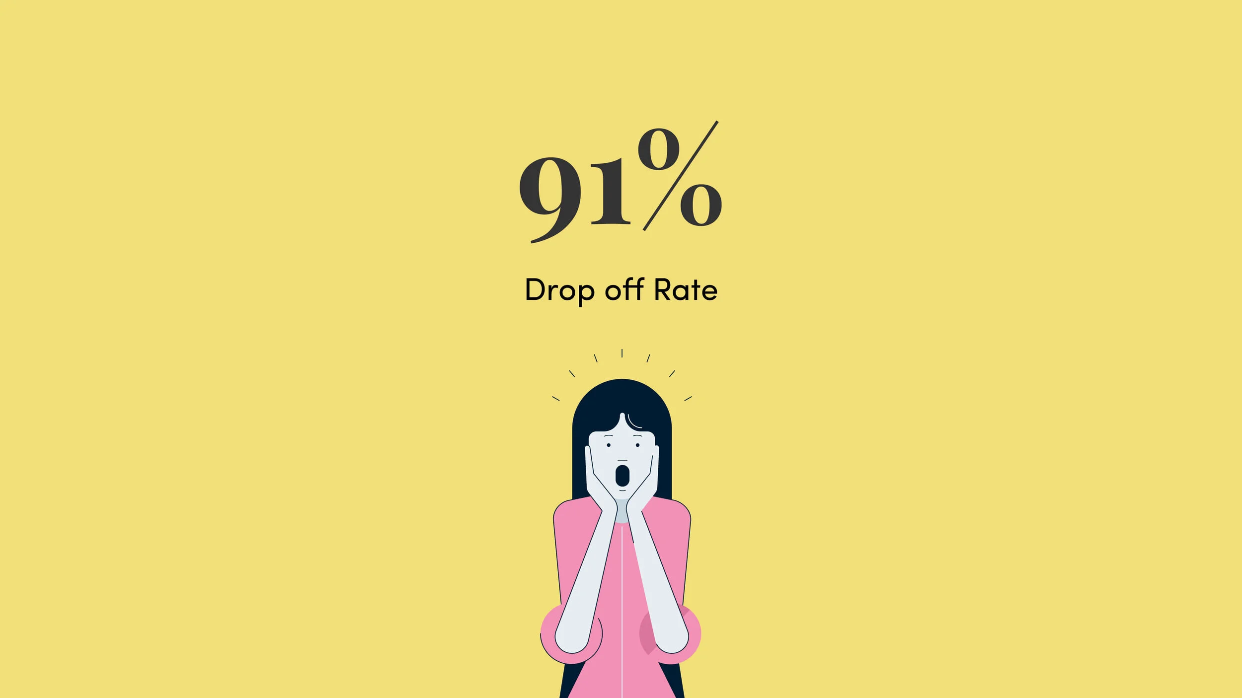
If you had tried opening a banking account through the app before 2020, you would have been redirected to a disjointed web application on RBC’s marketing website. This resulted in a 91% drop off rate from discovery to fulfillment.
RBC also failed at attracting newcomers and students digitally due to strict regulations and the outdated application. The manual input of identification details was tedious, timeouts were a common occurrence due to security purposes and the legal agreements step was not optimized for mobile.

The previous mobile account open experience 👆🏼

How can we streamline the application?
The Challenge
Short & Sweet
Our ultimate goal was to design a short, seamless and engaging account open experience for mobile prospects across two digital channels to improve conversion. Our ambition was to create a strong foundation that will sustain future product opening experiences.
Designers from two separate teams had to come together to design the flow as we were going to take a similar approach as the previous experience - stitch native and web flows together as one.
Our high-level goals were:
Maintain a consistent design direction
Set prospect’s expectations early in the flow
Streamline high friction points such as legal agreements
Engage new clients with an onboarding experience
Playing around with different elements in first concepts.
My Role
Conceptualizing the design direction
Knowing we were going to consume parts of the experience as web-views in the native app, my goal was to create a visual design direction that was simple, digestible and sustainable that both teams could follow. I also wanted prospects to be oblivious to the complexities of what it meant to stitch together native and web elements when they were going through the application.
-

Conversational
My aim was to design headers that would set the the tone of voice throughout the flow. Since prospects would be going through this application on their own, I wanted it to feel as if someone was having a conversation with you.
-

Personality
I explored using illustration to add personality. However, was it going to be sustainable - would we have to create an illustration for every step? How much is too much personality?
-

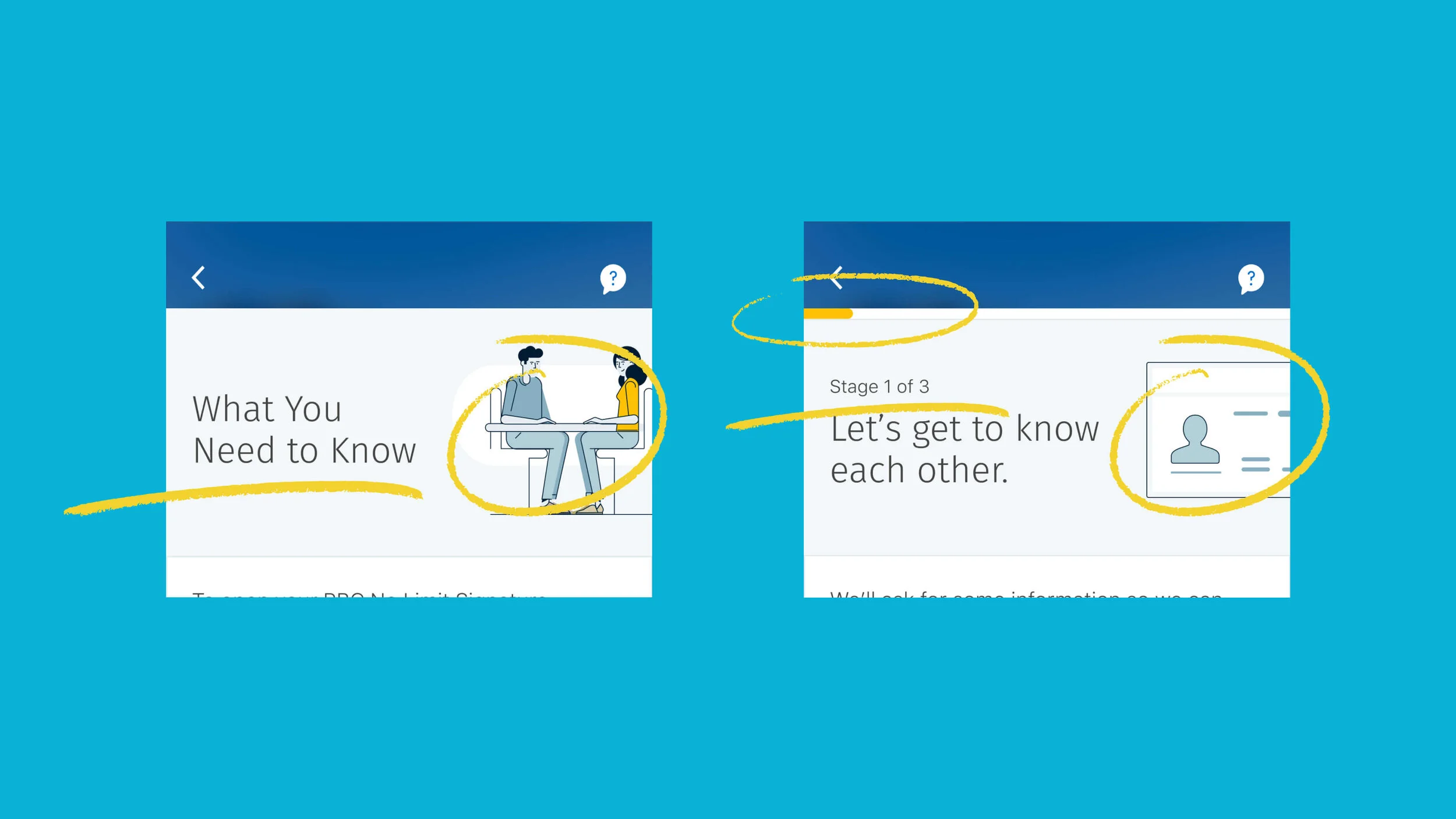
Progress
Adding a simple and visual indicator that would show you how much progress you’ve made so far.
-
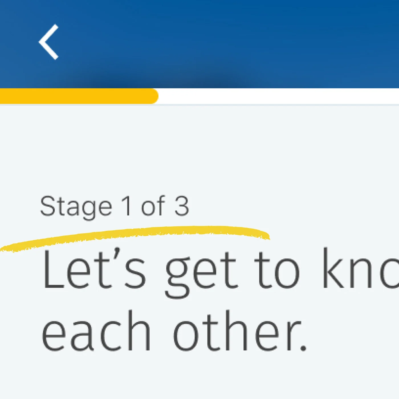
Stages
Not only did I want to give people a sense of how much progress they have made, I also thought giving them an idea as to what stage they were in was going to be helpful.
Setting expectations before you start
My assumption was that if we set up expectations early in the flow - prospect clients will understand the criteria they need to meet, be fully aware of what’s involved in the self-identification process, and be ready with anything they need before starting the application.
What I wanted to achieve:
Create a criteria checklist for prospects in order to redirect them to elsewhere if they don’t pass.
Summarize the flow into three stages and provide any helpful details to prepare them for the application.

Setting early expectations
Concept Testing
What did we set out to learn?
My team and I presented our initial concepts to both RBC and non RBC clients who were thinking of opening a banking account or who had recently opened one. We also used a self identification flow from another app to understand participants’ attitudes around using this technology and figure out any friction points along the way.
We wanted to understand how Canadians felt about opening an account through an app and their comfort levels with scanning their ID online to verify themselves. Most participants were unfamiliar with the concept of opening a banking account through an app, but it was well-received - many stating that it would be easier and accessible. All participants also felt confident in using the self-identification feature and were pleasantly surprised with the idea that application would be automatically filled based on the data captured from their ID.
Key Insights
-
Self-Identification (Selfie)
People expressed anxiety at the thought of the bank keeping their selfie on file. Our next step was to provide an explanation about how we verify a selfie with their scanned ID and reassure them that the bank is not keeping the picture on file.
-
SOS
Since people are doing this on their own without the help of an advisor, many participants stated that any guidance they could get along the way would be helpful.
-
The Nitty Gritty
Most participants stated that they never read legal agreements in its entirety,, but would like the option of downloading it so they can reference it later.
-
Account Selection
When people are selecting a banking account, they are generally looking for specific features that are relevant to them.

Using key insights from the concept testing to inform our next iterations on designs.
Usability Testing
What was the overall perception of the redesigned flow?
For our usability studies, we aimed to learn if the overall length of the flow was okay for most people, what steps stood out and whether there were any major pain points.
What worked? (Yay)
Overall, the pace of the flow was seen as short, optimal and digestible.
The What to Expect screen was very effective in framing people’s expectations upfront.
People trusted RBC as an institution and were generally unconcerned about scanning their ID.
What didn’t work? (Oh no)
The legal agreements step almost felt "too easy ". It might reduce people's acknowledgement when they were agreeing to them.
Content around sensitive topics like taking a selfie and credit check could be more explicit to provide reassurance.
A couple of key CTAs and value props were missed early in the flow due to lack of information hierarchy.

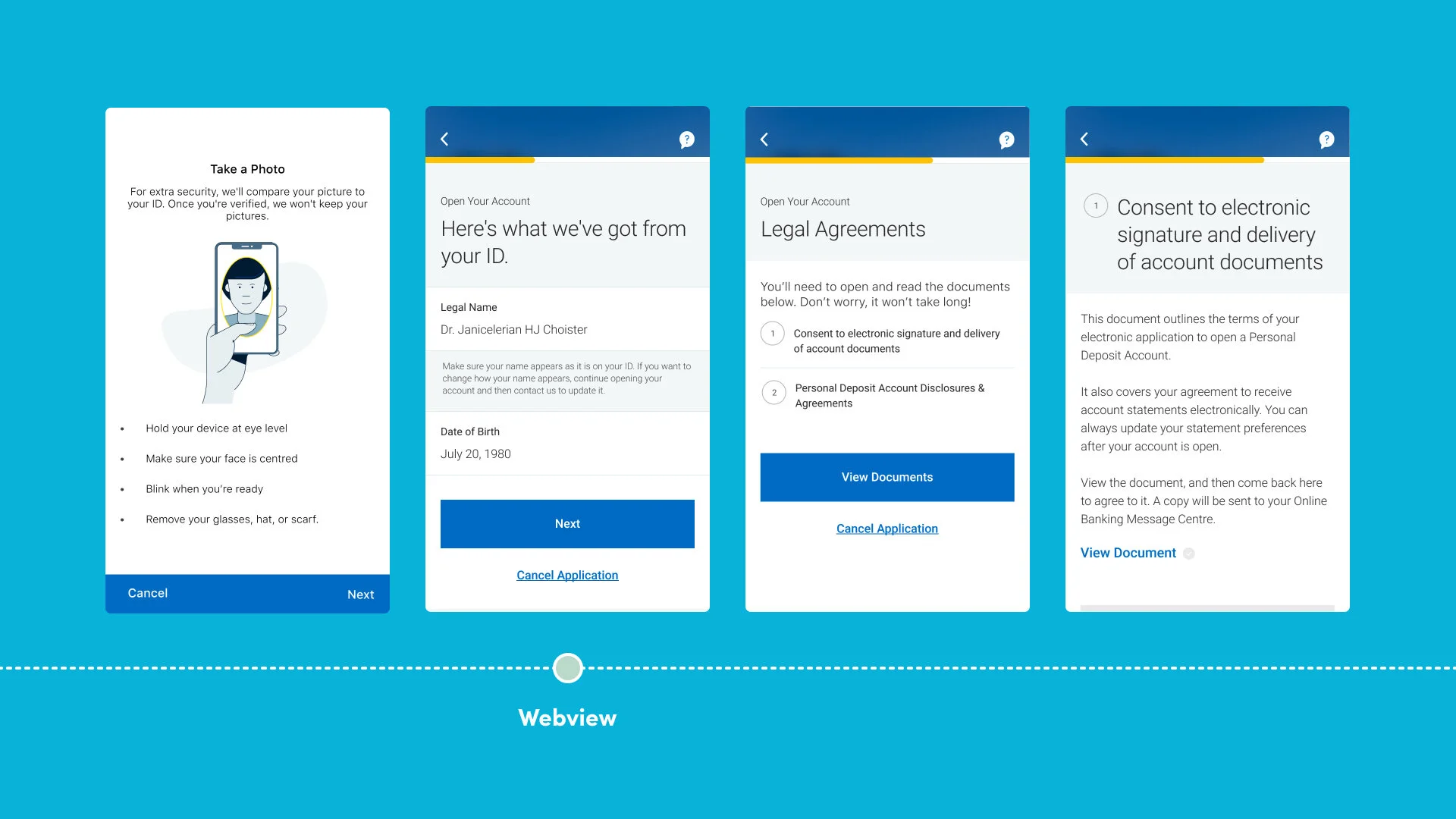
Our MVP Account Open for the RBC Signature No Limit Banking account

Results & Impact
Between our MVP launch in November 2020 to February 2021, 516 RBC Signature No Limit Banking Accounts had been opened and the average time it took to complete the application was ten minutes.
Since then, we’ve slowly been adding more banking products that clients could choose from to apply for from the RBC Mobile’s Prospect landing screen to improve conversion rates.
Design Impact
I achieved my goal in creating a strong design foundation that other digital teams could leverage for their own products. The design elements such as the headers, progress bar, and illustration style became standardized and were also translated onto desktop for products such as RBC Investease. The overall structure such as setting up expectations upfront and breaking up the flow into stages were also leveraged.
Reflections
This project was a huge endeavour because it brought two product teams together to redesign the account open flow and it was unlike anything I had been used to. In the end, I was successful in ensuring that our collaboration was maintained throughout. This became the ideal model for other teams working on projects with a similar setup across RBC Digital.